


 It wasn’t very long ago that salespeople used pen and paper to note down the sales enquiries, scribbling down the details of prospective buyers. After a while, computers took over and digital notepads replaced paper, which were finally replaced by web forms. To state the obvious, this means that businesses don’t need to note down the information anymore – it’s captured automatically, and organized for later use.
Talking specifically about online lead generation, this information is used to contact the prospects with an intent to convert them into buyers. In this article, we will see how form design can help fire up your lead generation – because design matters – I have seen the form design alone increase conversions by over 20%.
A form is the heart of lead generation
You rip the form from your page and your lead generation stops working. You can live without sub headlines and testimonials, but you can’t without a form. Actually you can, but you won’t generate any leads. In the last few years there have been significant improvements in web forms, helping designers and marketers come up with clever ways to generate leads with delicious design and compelling content.
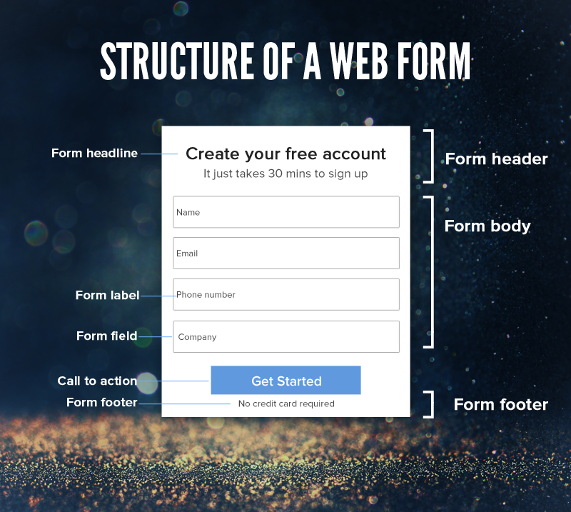
Don’t think of form as a supporting element on your web page. It should be fully capable of standing alone, i.e. selling the offer even if you take away all the other page elements. You can also call it a mini landing page. Forms can come in different shapes and sizes. Here’s the most widely recognized structure of a lead generation form:
Web Form Design Ideas
First things first, by design I don’t mean look and feel alone. Design is the essence of things. It’s what makes something work. And to make the form work, you need to optimize it for conversion. Conversion happens when someone fills up the form and submits it. This post is dedicated to that – generating more leads with tweaks to form design. Below is the list of simple, but often ignored ideas which will fire up your lead generation.
1. Abandon the impotent form
This is the first point, because none of the points below would work, if this isn’t set right. No matter how good your form looks, how intuitive it is, or how well-written the copy is, it won’t work without an offer. People don’t want to fill form, they want to claim an offer – it’s as simple as that. The offer could be to learn more about your product (inquiry), an e-book (resources), a consultation or a free trial to name a few.
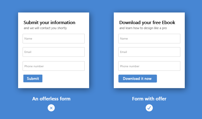 Filling up form is a pain and you need to override that pain with the pleasure of claiming the offer. There are way too many offer-less forms on the web, and they do nothing for conversion. Kill the impotent form.
2. Conversation for conversion
Design your form like a logical conversation. If you are a salesperson, how will to talk to your prospect? You won’t ask for a phone number before asking their name. Keep your form fields in a logical order of a natural conversation.
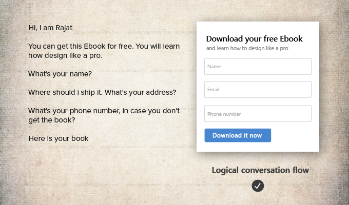 Our brain is in auto-pilot mode while doing most of our day to day activities – when we drive, clean our room or when we are fill up a form. The natural, conventional conversation helps your visitors fill the form without even realizing the effort.
3. Be creative with the header
There are more ways to utilize the form header than writing the same old headline and sub-headline. Think of creative ways to make the form compelling. Check out this form header used in a webinar landing page:
 See how the speaker’s information on the form header attracts attention, while giving credibility to the form. A visitor quickly connects with the speaker, which increases the chances of form fill.
4. Eliminate the unnecessary
Don’t crowd your form with unnecessary details. The more fields you have, lesser are the chances of conversion. With every field you add, probability of conversion drops. Make sure that you only keep the fields that you really need.
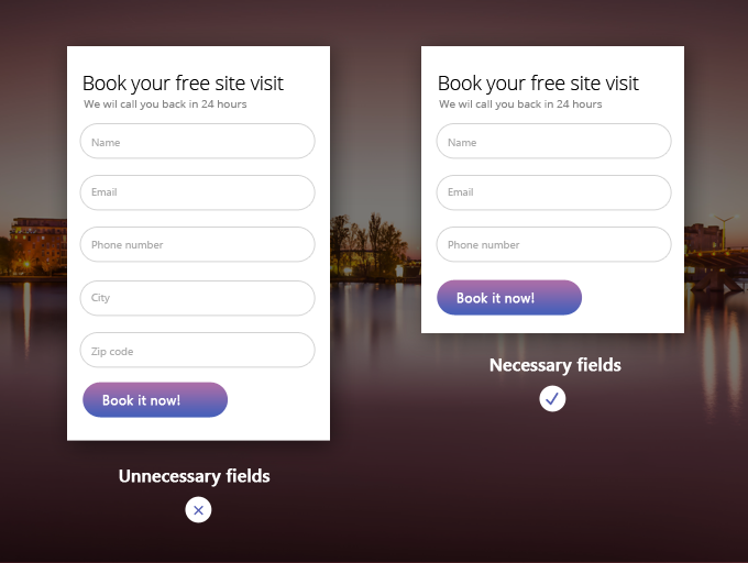 Why would you want to keep a city field in a form that’s obviously being used in a location targeted campaign? Even if it isn’t, you can still capture the location by IP tracking. Zip code isn’t needed either, because as started on the form, the salesperson would anyway call the prospect to confirm the address.
5. Use Auto-fill
Auto-fill is a technology where the form fields are filled automatically, if you already have them. For example, if you host a webinar every week, and send the invitation to the same list of prospects, they shouldn’t have to fill the form every time. Only the unique visitors should take this pain.
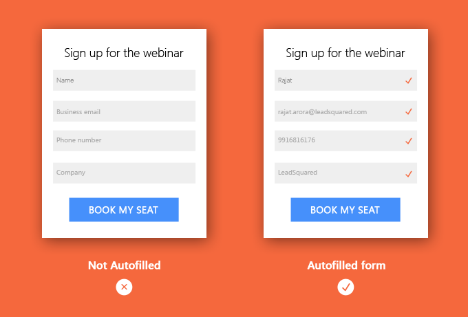 In case of auto filled forms, there is just one action to take – click the call to action. So much easier! Shibani Roy, our webinar expert says :
 “Auto-filled forms increased our webinar registrations by 25%. It is super convenient for the attendees and of course, it just saves time. Think of it in this way. If you regularly order food or even clothes from a specific food or clothing brand, isn’t it easier to just have your address already there instead of putting that in every single time? It’s the same thing.”
6. Pop it up
Form is the most important element on the page, because that’s where the transaction happens. The prospect claims the offer and you get the contact information you want. For that very reason your visitors should be able to discover it easily. Below are some of the design principles commonly used to draw attention to the form on the page.
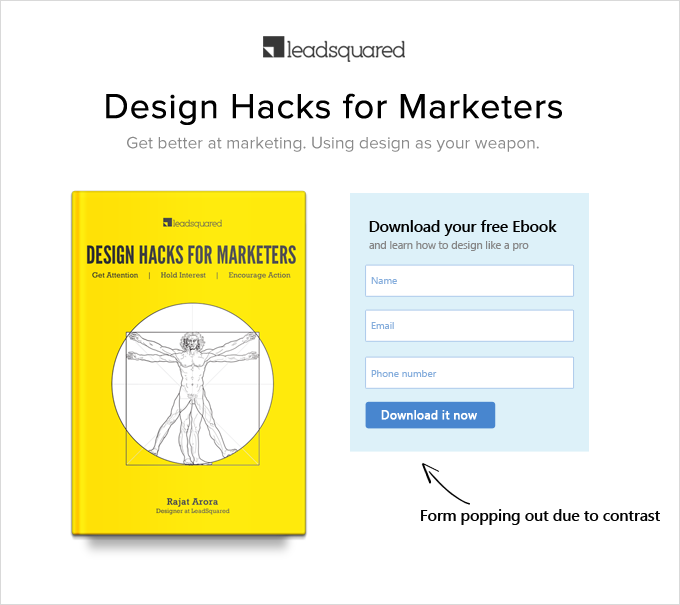
Contrast – Contrast is the state of being strikingly different from the surroundings. Our brain gives special attention to a disruption in the pattern. That is why the form colors are generally contrasting to the page it’s on. Below is the example of a good color contrast. The contrast can be from shape, size and position as well.
 Encapsulation – Encapsulation is when you place an object within a shape to highlight its importance. The most common example is the border. We add borders to the form to define it and make it look more important.
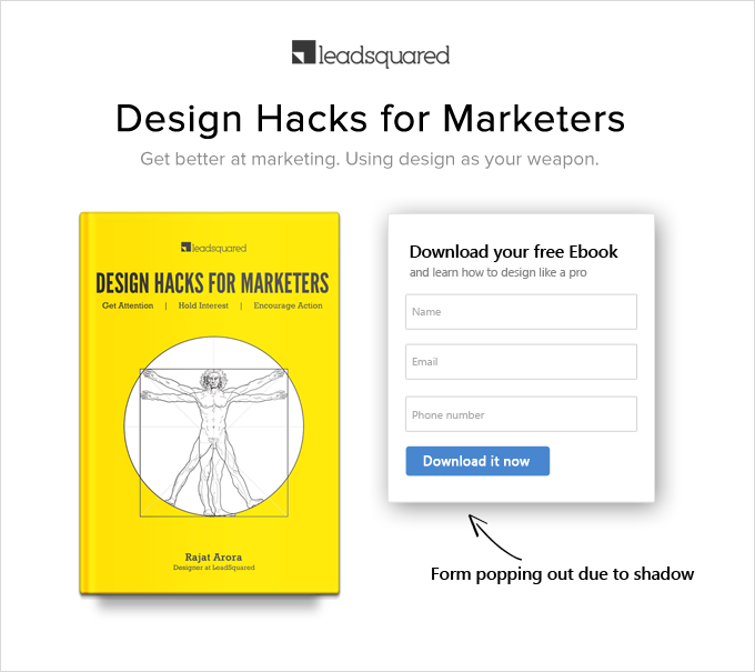
 Shadow – In graphic and web design, shadow is used to give a sense of depth to the object and hence helps in popping it out from the rest of the page.
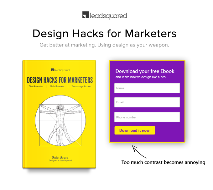
7. Pop, don’t scream
There is a difference between popping up and screaming. An excess of contrast can catch attention for sure. But can it hold it long enough? The idea is to get the attention to the form, after which the offer takes over. The form below shows how too much contrast can annoy the eyes, causing the visitors to bounce off.
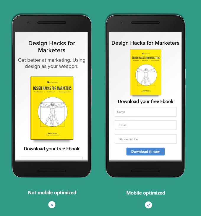
8. Make sure it looks good on mobile
Your form should render well and above the fold on every device, even if that means modifying content to suit different devices. The example below illustrates how you can optimize content so that form fits perfectly on mobile.
9. Use visual cues
Visual cues are signals to direct attention to something important. We can’t help but pay attention to an arrow or a pointed finger.
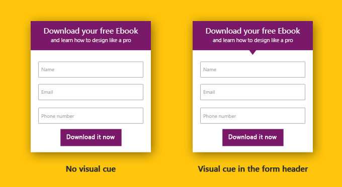 See how a downward pointer instantly draws your attention to the offer below, without disturbing the form layout
10. Keep it aligned
A well aligned page looks good and is much more readable than its unaligned counterpart. Check out the example below:
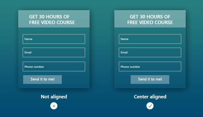 We like symmetrically aligned things, be it a face, an object or anything else visual. Alignment makes it easier to understand things, and is therefore a very important part of form design.
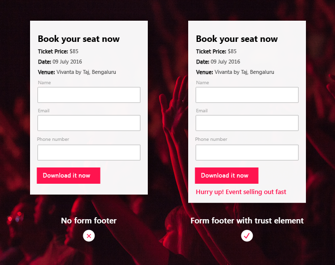
11. Use form footer to encourage action
Form footer is often ignored but it can be your secret conversion weapon, if used well. The psychological principle of trust and scarcity are commonly used in the form footer such as – Only 100 spots remaining (scarcity) for webinar form or 1000+ downloads (trust) for the eBook form.
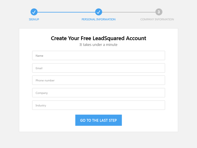
12. Break a long form up
Breaking a long form into parts makes it a little less intimidating. Also, while filling out a complex form, people like to know how much is still left. Have visual cues to convey that information. Making it clear and intuitive avoids frustration and helps a visitor to stick, increasing the chances of conversion.
13. The call to action
Call to action or CTA or a form button (in this context) is an instruction to the audience to provoke a response. The call to action is such a vast topic in itself that it needs a new post all together, which i will should write soon. In the context of this post it is the last step of conversion.
 As soon as a visitor hits the CTA, the information gets submitted and you have generated a lead. The three most important things to keep in mind while designing call to action buttons are :
Make it action centric – As cliched as it may sound, “submit” doesn’t not work. It does not mean anything. Use action words like – Download it now, Free trial, Free Ebook. Something which immediately demands action.
Keep it contrasting – It is the action center of your marketing campaign, it should be strikingly visible on the page.
Make it look like a button – We are used to clicking buttons. It gives us the cue that we are supposed to do something now (take an action).
That’s it for form design here.
Hope you found these ideas useful; now use them to up your lead generation, and please let me know how it goes.


