


So, weather reports predicted a storm, and all we got was a mild breeze. But, what do you do after a near-miss? Do you sit around in your feeble house, waiting for the catastrophe to strike, or fix it right-away, and sleep peacefully at night?
It’s almost a month since the Google mobile friendly update first rolled out, and at a glance, it’s effect has proved to be nowhere near what was predicted.
Update: We certainly have seen a positive impact, though. I compared the Google Anlaytics mobile organic traffic data for April 21st to May 21st against March 22nd to May 21st, and there has been a 54.97% increase in the number of sessions, and the average session duration has increased by 126%. (You should also look at this data in Analytics to see how it has changed over time).
So, I would call this delayed impact, an opportunity for everyone who needs to, but hasn’t gone mobile-friendly yet. Would you really rather wait for your rankings to drop, before you actually change your ways? God, you must be lazy!
The update has been called the most gradual yet, which explains the smaller than predicted impact noticed by the webmasters, therefore, in all probabilities, it would affect your website sooner than later.
If mobile traffic is important to you, and you haven’t done anything about it, well, Google or no Google, you are losing important business opportunities. I’ll give you an example proving the kind of impact a simple switch to mobile-friendly can do for you:
Clothing brand O’Neill went the responsive way for their website, way before “Mobilegeddon” was even a thing.

They saw immense improvements in the goal completion and overall revenue from their website. Here are the results after the website change.
For iOS
- Total Conversions increased by 65.71%
- Transactions augmented by 112.50%
- Revenue went up by 101.25%
For Android
- Conversions augmented by 407.32%
- Transactions increased by 333.33%
- Revenue increased by a mammoth 591.42%
(Source: ElectricPulp)
Isn’t it obvious, and very much in line with Google’s guiding principle? Make it easier for the user to take an action, and everything else would just follow.

So, let’s discuss everything there is to know about Google’s mobile friendly update, and what you can do about it.
We all know that Google has been really generous this time. Not only did they announce the date of the update 2 months in advance, but they also conducted several hangout sessions to help small business owners understand what’s needed to be ready for the update.
So, to start, check your mobile rankings – without a responsive website, you may or may not have dropped ranks. As I stated before, the changes have been gradual, and not many webmasters have noticed significant changes yet.
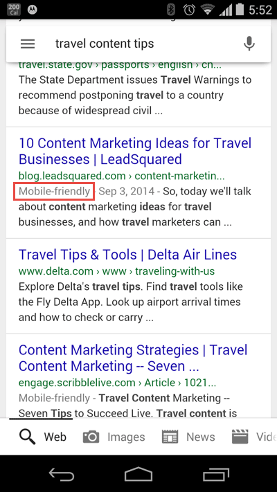
So, this is how you would know in search results that your website is mobile friendly – that little mobile friendly label in the search results.
Got it? Great!
Let’s discuss what the update entails and what can you do about it if you haven’t started or if you are halfway through and muddled about what to do first.
What does the update affect?
1. Has affected mobile searches ONLY
Google remained true to its word, as the update has affected only mobile searches, not desktop ones, not even tablets. Not yet, at least.
2. Has only affected organic search results, not ads or other results
The algorithm has only affected the main “organic” search results, not other segments like “ads”, “news”, “in-depth articles”, or local results.
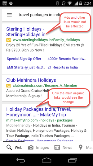
Top ads are still on top even if they aren’t linked to mobile-friendly websites. However, I would still say, if you are running ads on mobile, it’s best to redirect those ads to responsive landing pages, or websites, because even though you are still discounted from the update, you are still losing money on clicks, because no one would really go through a page on mobile, or fill a form, if the page offers a lousy experience.
Brand keywords still show brand websites on top, even if they aren’t mobile friendly.
3. Mobile friendliness is being indexed on per page level
Mobile friendliness is being crawled on page level, not the complete domain level. So, all the pages on your domain need to be mobile friendly – this includes all your website pages, your blog and your landing pages as well.
If some of your pages are responsive, and others aren’t, the responsive ones would benefit from the update. So, if you haven’t started updating your website to make it responsive yet, you might want to start with the most popular – already high ranking pages on your website, and make your way around all the others.
4. App related queries show app results
Queries that are app related would have the high rated apps rank higher than normal search queries. For instance, I have looked for vocabulary games here, and GMAT practice.


They all show up app results with a CTA to download the app. So, if your business has an app, you would do well by:
a) Having perfect keywords in the title and description of the app
b) Deep linking your website and the app pages – both would pass along authority to each other.
5. Changes are crawled real-time
Even though April 21st was touted as a very important date, the crawling is real-time, so if you are for some reason, still not mobile-friendly, make the changes, and it would be crawled and updated as and when you update it, and resubmit for indexing, or whenever Google indexes it next.
So, what what are you supposed to do?
I) Test your website on Google’s Mobile friendly test tool
It would give you a kind of layman overview of what’s going on with your site without going too much into the technicalities of what’s wrong. You can use it as a starting point to identify the problem areas, and take it from there.
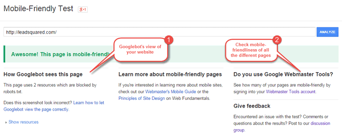
This is the view you would see if your website passes the test:
In case your website isn’t mobile friendly yet, this is the view you would see:
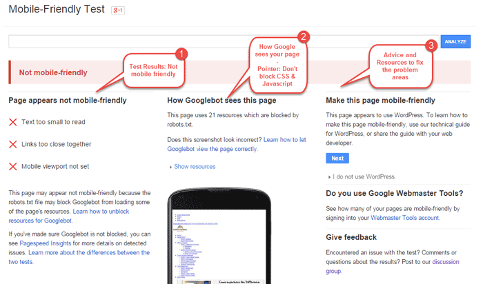
1. You can see the basic problems because of which your website failed to pass the test.
Now that you know the problem, you can start fixing them, or get your webmaster, agency, or whoever created your website to fix them. If you are going all out with a responsive website, even better. But this would give you a good starting point.
The tool tests one url at a time, so if you tested your complete domain name (www.yoursite.com), it doesn’t mean that all your pages are mobile friendly – www.yourwebsite.com/pricing might still not pass the test.
2. Allow your robots.txt files to crawl the css and javascript.
3. Follow Google’s advice on basic fixes
Another great thing of the tool is that in addition to telling you the problems, it also points you to the fixes. In the above image, point 3 shows Google detecting that the website is on WordPress and pointing the webmaster in the right direction. There are other really helpful resources there as well.
II) Test your website for mobile usability
You would find this tool after logging in to your webmaster tools, as the last head under “Search Traffic.” It would show you all the different issues with the usability of your website on mobile devices.
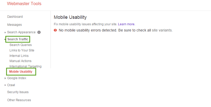
If your website is responsive and doesn’t have any usability issues, you would just see a message stating that there are no usability issues.
III) Know how much of your traffic is mobile-driven
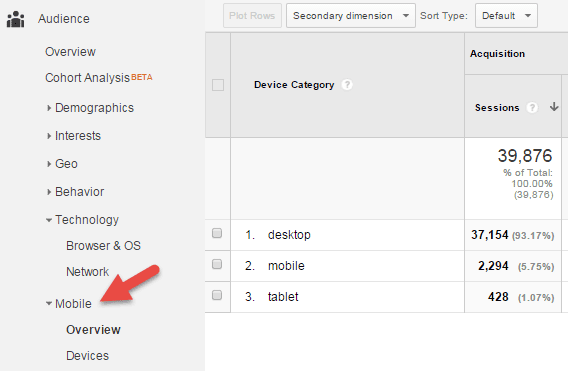
This would tell you whether or not it’s worth it for you to make the update to mobile-friendly.
IV) Know how much of your mobile traffic is organic
Now, remember, the update is only going to affect the organic rankings. Check how much of your mobile traffic is organic. You can do this simply by adding “Source/Medium” to the secondary dimension while you are in Audience > Mobile > Overview (the above screen)
V) Having identified the problem areas, start fixing them
Use the resources suggested by Google in mobile friendly test. Google has shared a lot of guidelines on what would constitute as mobile friendly design. Here are a few things to point you in the right direction.
a) Mobile friendly doesn’t only mean responsive design
Though responsive is something that Google recommends, there are other ways of giving your mobile users a good experience. So, you can continue maintaining a m.xyz.com website, if that’s what suits you, and if your mobile site is properly maintained, and doesn’t have faulty links, you would get the benefit from the April 21st update.
b) However, opt for responsive design if you can
Yes, you can continue using your mobile versions of your website and it would still be considered mobile-friendly by Google, but responsiveness would cut down an immense amount of your work in the long run. These are the obvious reasons why Google recommends responsive design.
a) You would need much less effort maintaining the site, because there is only one version for you to maintain.
b) You don’t have to worry about faulty links. Redirection and canonicalization is very important if you have 2 websites (one for mobile and one for web). You need to make sure that the mobile website pages are canonicalized properly against its corresponding desktop counterparts.
c) It should be easy for users to complete their objectives
Depending on your business, the objective of the users might vary.
If you are a retailer, the complete process of selecting the products, adding them to cart, and checking out should be completely user friendly.

If you are a blogger, the content on the page should be easy to read. This would include making sure that the font size is big enough, the line heights are easy on the eyes, the pages are lightweight, and don’t take forever to load (you might want to reduce your image sizes, or even hide images in certain sections, if they are not needed on the mobile version).
This has already proven to be true in case of many businesses that went responsive, even much before the algorithm update. Remember the O’Neill example above.
d) The content should be readable, and actions easy to take
i) Tap targets should be minimum of 7 mm high and wide. This means that anything clickable – checkout buttons, or any other Call to Action buttons must be big enough for an average human thumb to click comfortably. Also, you must leave 5 mm gaps between tap targets.
ii) Font size: Don’t have a base font that’s too small. Using 16px as the base font size is a best practice in most cases.
iii) CSS line height should be minimum of 1.2 em, for it to be comfortably readable.

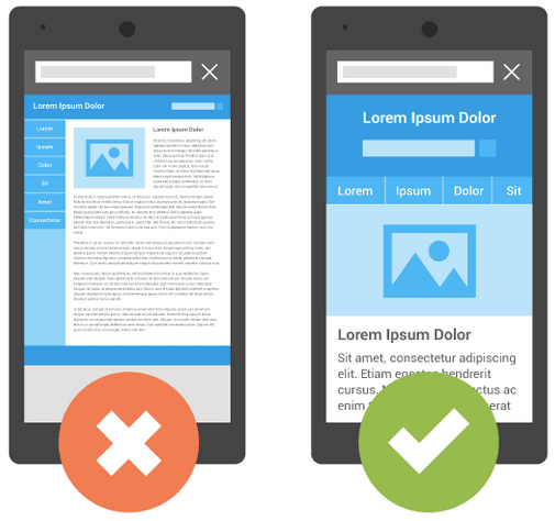
You can see in the image on the left that the text is painfully small to read. (It is still better than many other websites I have seen), and on the navigation bar, some things would be really hard to click comfortably.
The image on the right however shows a good example of a well designed site. The content is readable and the buttons big enough to click.
iv) Avoid lateral scrolling – lateral scrolling is when the users have to scroll horizontally to read the content from left to right. This definitely does not constitute good experience.
v) Mobile viewport: If a user comes to your website, and has to pinch and zoom your content, user experience takes a major hit. To avoid this, you need to add a viewport metatag in the head of document. This document would help.
Without going into the technicalities, I would point you to Google’s hangout videos that can help you.
e) Handling media elements
If you have media elements like videos etc. make sure that the plugins they are using are supported in mobile browsers. This is why Flash must be avoided.
f) Content Quality
It’s all about the user experience – this includes the content quality. Are you answering the relevant questions? So, if you have a responsive/mobile friendly website, but crappy content, that’s not going to cut it either.
g) Proper canonicalization if you have separate mobile and desktop websites
Redirection and canonicalization is very important if you have 2 websites (one for mobile and one for web). using a rel=”alternate” tag on the desktop URL with a rel=“canonical” tag on the equivalent mobile URL
h) Be wary of using elements that aren’t mobile friendly
Be careful of what WP plugins you are using, and anytime you apply something new, make sure that you still pass the page speed test.
i) Force bots to reindex updated pages
Use submit function in webmasters tools after you are done making the changes.
So, right this is what can get you started with a mobile friendly design.
I would reiterate that even though many webmasters haven’t seen the changes yet, it doesn’t mean that you shouldn’t be ready, or forget being ready, just give a good experience to people landing on your website.


![[Webinar] Sales Automation 101: Unclog your Sales Pipeline](https://www.leadsquared.com/wp-content/uploads/2024/04/automation-webianr-popup.gif)